http://massivelyop.com/2017/04/18/crowfall-has-big-changes-in-store-for-its-alpha-ui/

An MMORPG with a crappy user interface doesn’t last long in 2017. ArtCraft has this lesson memorized and has put it to good use in Crowfall, if today’s dev update is any measure.
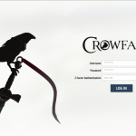
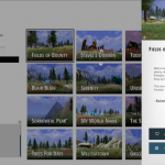
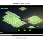
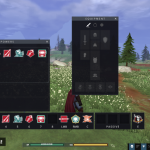
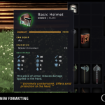
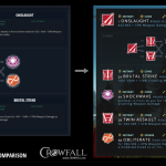
UX Design Lead Billy Garretsen grants game-watchers a tour of the evolution of the PvP MMO’s alpha login screens, kingdom selection screens, heads-up display, and tooltips. The first thing you’re going to notice? It’s very white, reminiscent of the sort of look capitalized on in 2011 by Dragon Age 2 and 2012 by Guild Wars 2. Inside the game, though, the HUD and tooltips are relatively dark and flat — an extremely popular look for everything from World of Warcraft mods to smartphone operating systems.
“Long ago we established a brand guideline that carried us through the Kickstarter crowdfunding campaign and development of our website and social media,” Garretsen says. “Over time, the UX presentation in the game has deviated and lost some of its brand identity” — and that’s what the latest revisions are meant to fix.
Still under construction by the UX team is the character sheet, tooltip layout, settings, the skill tree, and — drum roll — HUD customization.
